Meet the Hilltribes


Who are the hilltribes? They're groups of people living in the hills of Northern Thailand... but they aren't Thai. They are Lahu, Shan, Karen, and a number of ethnicities that do not have a country to call home.

Many of them are refugees who had to escape Burma or other places due to ethnic persecution. Living in Thailand can also be difficult, due to a lack of citizenship rights and protection. Every step of the way, however, they've been committed to making things better for future generations through sustainability and community management.

 
A754F41B-F4F1-422D-AD0A-FF0C5DDD7E96.jpg
DSC_0864.jpg
DAFE7ADA-C9BC-4A5F-B989-529326907913.jpg
 

In November 2017, I had the opportunity to visit the communities of Huay Lu Luang and Ja Su Pah outside the city of Chiang Rai. The community members of Huay Lu Luang had been a part of Plant With Purpose's program for close to a decade. As I met with people from the village, they expressed how their lives had gradually gotten better as they learned to manage their forest as a community.

I was able to capture several stories of Plant With Purpose's impact.

VIDEO


NA KUH: CHANGE STARTS IN THE BACKYARD

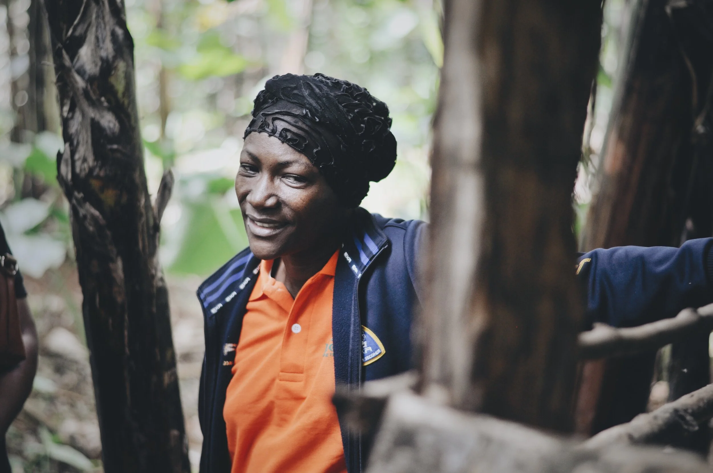
Meet Na Kuh, a refugee, a farmer, and a grandmother. Years ago, she partnered with Plant With Purpose in order to pursue her big dream: for her community to work together within the village with no need to leave.

NARRATIVES

24858436298_1244f22265_o (1).jpg

jah cho

Jah Cho has seen how hard life can be. In Northern Thailand, you’ll find dozens of small villages where ethnic minorities live. Most have not been granted citizenship, making it hard to find opportunities to earn a living.

THE GIFT OF SUSTAINABILITY

Screen Shot 2020-04-20 at 2.01.54 PM.png

ah jee

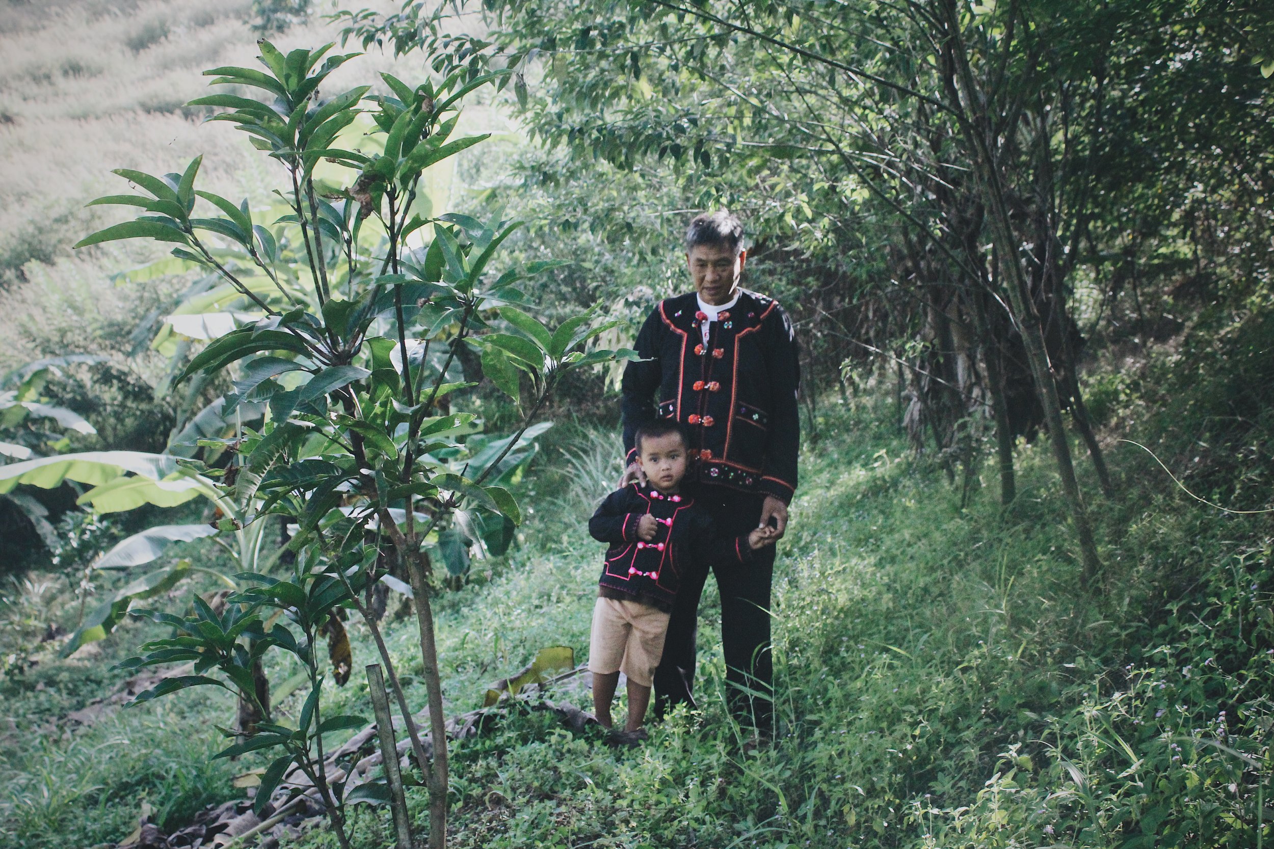
Ah Jee’s entire demeanor radiated joy. He introduced us to his wife and their grandson and spoke about the hopes they had for the next generation and their village.

“Sustainability is important,” he told us. “You are together as a community and the togetherness should be carried on by the next generation.”

SOCIAL MEDIA

@PLANTWPURPOSE

“Hi I am Ah Boh, my wife is Nah Lo Kah. We have lived in this village for about three years. I used to live here when I was young. I left for school in another village. I got engaged, then married, and I moved back and have been in this village for …

“Hi I am Ah Boh, my wife is Nah Lo Kah. We have lived in this village for about three years. I used to live here when I was young. I left for school in another village. I got engaged, then married, and I moved back and have been in this village for three years.

They grow rice and corn in this village.

Farming is hard work. It’s hard growing rice and corn. For corn, we sometimes have to use herbicides when it gets too hard. The forest is important because having a forest means you have a good environment, you have a cool weather.

Families here do not have their own land or knowledge for farm management. In this village, land management is different because it belongs to the village chief. They can use the land but cannot own it because it belongs to the chief. They want to have their own land, they want to have their own trees. They don’t know how to do this yet, while the land belongs to the chief."

"My name is Ja Buh. Na Kuh is my wife.My parents left (Myanmar) and took us here because they didn’t want us to go end up working for the military. I met (my wife) in this village when we arrived.  I started working with @plantwithpurpose five years…

"My name is Ja Buh. Na Kuh is my wife.

My parents left (Myanmar) and took us here because they didn’t want us to go end up working for the military. I met (my wife) in this village when we arrived.

I started working with @plantwithpurpose five years ago. When I started, I joined an agroforestry farmers’ group. After that, three years ago, I started working by raising pigs as a demonstrator.
.
Sustainability, for me, is like starting an agroforestry plot. Even though I can’t harvest it all during my lifetime, I can pass it on to my children. They can take care of it and pass it on to their children."

“When I was in Myanmar I served in the Burmese army for 10 years. We fought another group called WAH. I saw combat and was forced to shoot. My friend was shot and I had to carry my friend while he was bleeding.  I felt pity, not just for my friends,…

“When I was in Myanmar I served in the Burmese army for 10 years. We fought another group called WAH. I saw combat and was forced to shoot. My friend was shot and I had to carry my friend while he was bleeding.

I felt pity, not just for my friends, but for the family of my friends who lost their loved ones. And sometimes they’d go a whole year without seeing their loved ones.

Here, the more you work, the more you receive, you can use it to help your family... being like this is better than working like slaves for someone else.

It’s not for just myself, but also my children. If you separate and just work on your own, you cannot live together. My children are my motivation to bring together leadership in the family. My faith inspires me to listen to one another and help, and that encourages me to bring that kind of leadership here, and to love my family.

When I was about my grandson’s age, I wasn’t like him. I never slept in my house... my family spent my childhood in the forest hiding. He will have a very happy life and if he wants to earn money it’l be easier for him.”

Defenders of Kilimanjaro


Mount Kilimanjaro is one of the Africa's most recognized wonders. The highest peak on the continent attracts hikers and backpackers from around the world. For the people of Northeastern Tanzania, however, the mountain is more than just a tourist hotspot. It's also a matter of survival.

 
Tanzania [1].jpg
Tanzania [6].jpg
 

As climate change has begun to cause the mountain's snowcap to melt, the farmers below face the possibility of floods washing out the nutrients from their soil, resulting in food shortages. If the loss of snow continues even further, then the water sources that would otherwise nourish their crops would begin to dry.

The farmers who live below Mount Kilimanjaro are often among the world's poorest. They may be vulnerable, but they aren't helpless.

 
Tanzanian Karibu [1].jpg

NARRATIVES

35456974490_9bc51410df_o.jpg

Emma Suya

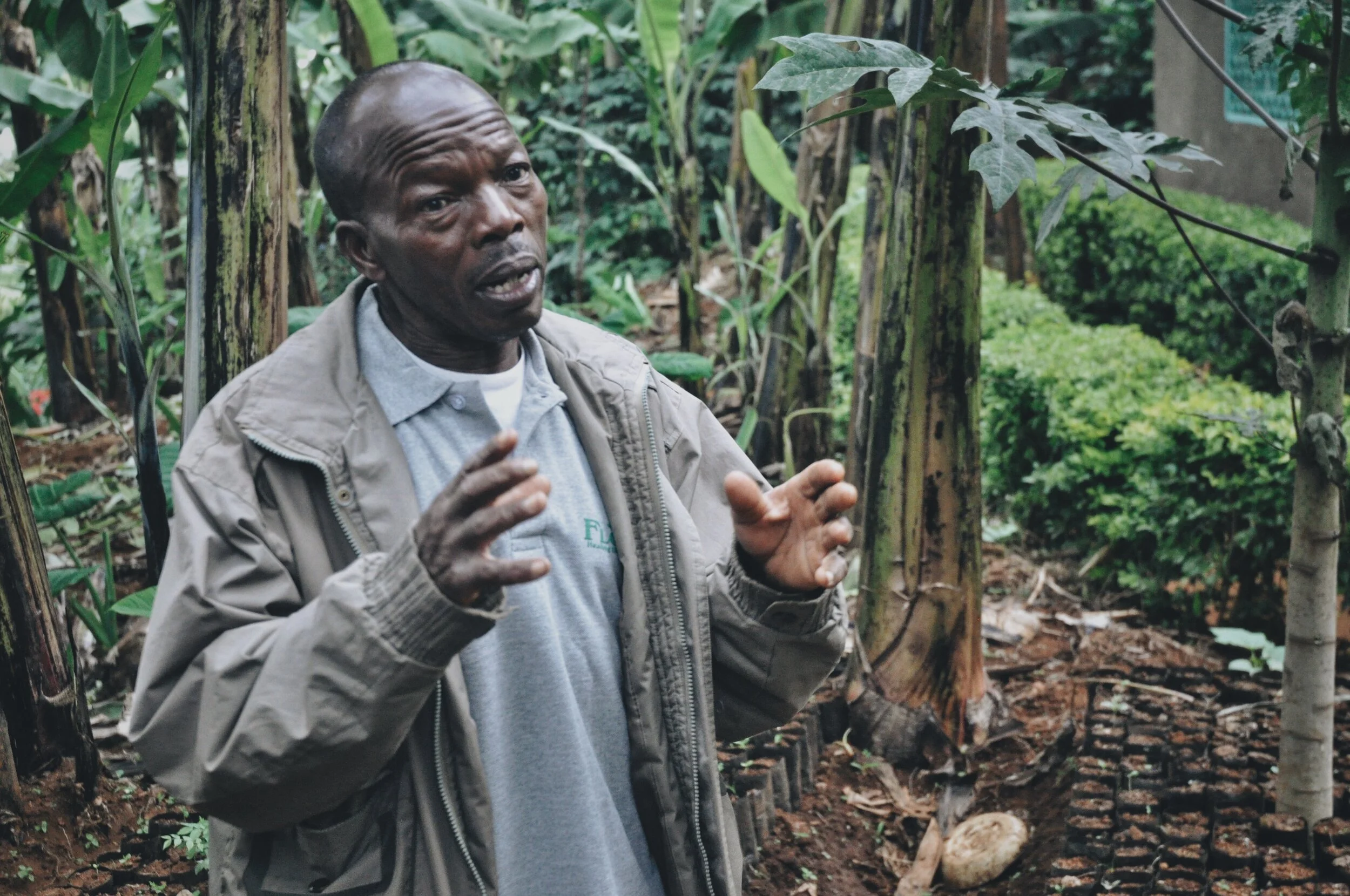
As a farmer on the slopes of Kilimanjaro, she suffered the effects of the environment’s turn for the worse.

35035258263_ede27cda9a_o.jpg

Julius

When Julius returned to the farm, he knew without question that it was exactly what he was supposed to be doing.

PHOTOGRAPHY

People of Siha [1].jpg
New Friends in Rombo [6].jpg
Christina [3].jpg
A Very Warm Welcome [8].jpg
The Sack Garden [5].jpg

ARTICLES

celebrate as you go

Screen Shot 2020-04-20 at 1.24.54 PM.png

celebrate as you go

Cheers, yodels, and songs immediately engulfed both sides of our vehicle. We turned onto a small pathway shaded by palms. We were bordered by smiling and cheering farmers, mostly women, rushing out to greet us. As we drove further up the path, they fell into a parade-like formation that followed us, erupting in songs that seemed to get louder and louder. The volume of the celebration only increased once we opened our doors to get out.

SOCIAL MEDIA

@plantwpurpose

“In all these environmental restoration activities, we are very happy because we’ve learned that doing this is taking care of God’s creation. We are not using harmful chemicals that will kill other organisms or affect our health. We are taking care …

“In all these environmental restoration activities, we are very happy because we’ve learned that doing this is taking care of God’s creation. We are not using harmful chemicals that will kill other organisms or affect our health. We are taking care of ourselves and we are happy about this.

We give vegetables to friends and people we know. We understand that God is love and we are happy being in a group together where we love each other and help each other. This is what I love about Agape group."

Since 2011, Richard Mhina has served Plant With Purposw Tanzania as the Country Director. Richard leads the local Tanzanian staff by setting priorities, strategies and overseeing implementation of programs as well as managing relations with stakehol…

Since 2011, Richard Mhina has served Plant With Purposw
Tanzania as the Country Director. Richard leads the local Tanzanian staff by setting priorities, strategies and overseeing implementation of programs as well as managing relations with stakeholders, communities, and donors.

When we asked him about being the boss to his 65 local employees he corrected us by saying “no no, I get to be a servant to my 65 person staff.”

"I want to tell you a brief history of my group. We started in a year and a half ago with twenty members. We are so thankful for Plant With Purpose for enabling us to do so many good things, especially with organic farming and environmental conserva…

"I want to tell you a brief history of my group. We started in a year and a half ago with twenty members. We are so thankful for Plant With Purpose for enabling us to do so many good things, especially with organic farming and environmental conservation.

We met a Plant With Purpose facilitator who told us about organic farming and conservation. Since then, we’ve changed. We’ve started using compost, and we no longer use harmful chemicals. We used to spend money on industrial fertilizers, but now we can save that money and use that in better ways.”

Ellie showed us where she used to live- a mud-and-clay structure, small in space. This was her whole house when she joined Plant With Purpose’s program.Some relatives were ill, and she had signed up to take care of their children. Before she had muc…

Ellie showed us where she used to live- a mud-and-clay structure, small in space. This was her whole house when she joined Plant With Purpose’s program.

Some relatives were ill, and she had signed up to take care of their children. Before she had much to give, she already had a very generous spirit.

It’s great when generous people succeed. Through hard work and the help of Plant With Purpose’s program, she was able to make upgrades to the home, eventually making a much nicer and more spacious home, right on the same plot as her old abode. She now uses it as her laundry room.

Geometric Illustration

Shirt Designs.jpg

PLANT WITH PURPOSE

Illustration has always been a valuable tool me to create eye-grabbing visuals for organizations.

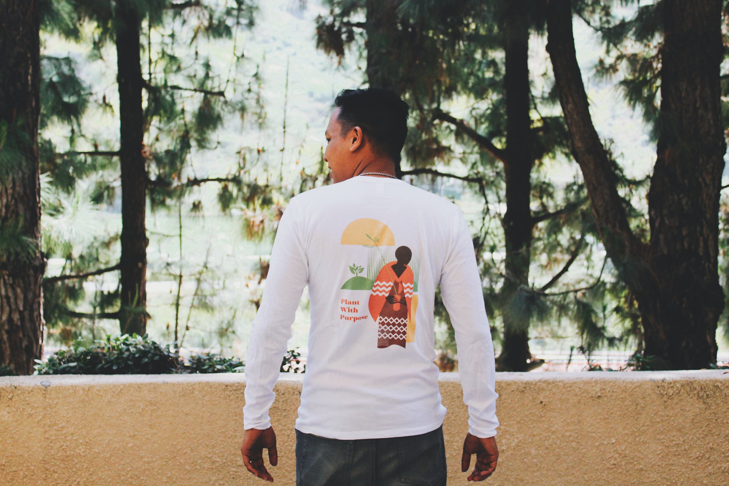
In this case, I was able to use basic shapes and patterns to turn an image of a Masaai tree-planter in Tanzania into a vibrant graphic for Plant With Purpose to use in a variety of products. This image in particular happened to live best on a long-sleeved shirt.

090 Long Sleeves.JPG

RHYS’ POSTER

While I’ve experimented with a variety of illustration styles, I’ve found a happy home base with geometric based designs. As an example of another geometric style of mine, this time based on cutout images, here’s a poster I made for my son’s room before he was born.

Rhys' Poster.png

Website Concept

Screen Shot 2020-02-14 at 4.02.48 PM.png

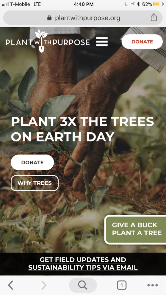
Here are three necessary skills when it comes to putting together a great website:

  • Understanding how to use strategic messaging on your website to make an impression on visitors and drive behavior

  • Putting together stunning visuals that feel original, inspired, and in-line with the message of the brand

  • Knowing the coding languages and bells-and-whistles that make things run well on the back-end

It can be really, really hard to finding somebody who has all three skills. I’ll admit that I only really have the first two. In order to help Plant With Purpose have the best website possible, I found it essential to team up with more skilled developers who could bring a level of expertise that I lacked.

What I did want to make sure to have a hand in were the aesthetics of the site, and the way it communicated our message to all those who came to visit. I worked to design a site that matched user behaviors, led to the behaviors we wanted to see more of, and that reflected well on the organization.

Screen Shot 2020-02-15 at 2.42.07 PM.png

Our site was originally built by Petrit and Korab Rudi, and maintained by Sagetree in Chula Vista, California. In order to communicate our needs to our developers, I used Photoshop to design mockups of the website we wanted. This gave us a stronger sense of what we wanted, and our developers a clearer sense of what we were working towards.

Screen Shot 2020-02-15 at 2.42.37 PM.png
Screen Shot 2020-02-15 at 2.43.23 PM.png
Screen Shot 2020-02-15 at 2.42.20 PM.png

We wanted a donate page focused on tree-planting efforts, along with a donate page focused on carbon offsetting and a more general-purpose donate page.

One of our main goals was to produce one of the most easy-to-use donation platforms possible. We tried to eliminate the amount of clicks needed to make a donation down to three while providing an engaging donation experience and maximum donor security.

Screen Shot 2020-02-15 at 2.42.57 PM.png

Our site was also designed to effectively show the impact of our international work through data and gathered statistics. We aimed for back-end systems that allowed data to make a smoother transition from field surveys to the screen.

Screen Shot 2020-02-15 at 2.41.40 PM.png
Screen Shot 2020-02-15 at 2.41.31 PM.png
Screen Shot 2020-02-15 at 2.41.54 PM.png
Screen Shot 2020-02-15 at 3.15.47 PM.png

Poverty Uprooted

Screen Shot 2020-02-14 at 4.04.17 PM.png

OBJECTIVE: Create a user-friendly visual guide that shows how Plant With Purpose’s environmental efforts are helping to eradicate poverty around the globe

Screen Shot 2020-02-15 at 1.35.14 PM.png

One of the things that makes Plant With Purpose unique as an environmental organization is the significant, measurable impact that its programs has on global poverty.

For a long time, environmental work and poverty alleviation have been seen as separate activities, while the two are in reality deeply linked.

This booklet was created as an intentional effort to help better communicate how this works in the organization’s international programs.

Screen Shot 2020-02-15 at 1.35.21 PM.png

The booklet was printed in 16 pages of full color, measuring 5x7. This size made it ideal for displaying landscape and panoramic images, containing rich text content, and providing room for the design to breathe.

This size also made it practical for use as a handout during events or as mailing material for Plant With Purpose’s community of donors.

Millions of families around the world worry about school fees, housing, and having enough to eat.

Joy and Joesf’s family used to be one of them.

Not anymore.

Screen Shot 2020-02-15 at 1.58.00 PM.png
Screen Shot 2020-02-15 at 1.58.29 PM.png
Screen Shot 2020-02-15 at 1.50.44 PM.png
Screen Shot 2020-02-15 at 1.58.08 PM.png

Poverty is a nuanced topic, and part of Plant With Purpose’s approach involves looking beyond income level as an indicator of poverty. In the context of overexploited countries, things like the materials of one’s home, meals eaten per day, and health of one’s soil are also important indicators. Plant With Purpose focuses on twelve relevant factors to form a mutli-dimensional poverty index.

I combined pairs of related datasets (ie. nutritional balance and meals eaten per day) under one underlying theme for each two page spread. In addition, I tried to represent the spectrum of countries where Plant With Purpose works. At the time, only Burundi was omitted, but images from the Central African country were included elsewhere in the booklet.
Screen Shot 2020-02-15 at 2.19.44 PM.png
Screen Shot 2020-02-15 at 2.19.52 PM.png

For a piece that was focused on a presentation of data, I wanted the material to appeal to both head and heart. Opposite pages that included data and textual descriptions, I opted to include large, full page photos, and direct quotes from the people pictured related to the theme of the spread. Quotes were handwritten in various styles of penmanship, adding an organic touch to the piece.

Smaller, secondary images were lightly featured in the background of the text page.

Screen Shot 2020-02-15 at 2.02.16 PM.png

The final images of this booklet included an illustrated two page spread of what it looks like when families in a community grow out of poverty together. It transforms both human development and environmental conditions. The booklet closed with high quality images of Burundi and a brief descriptor of Plant With Purpose’s mission.

Screen Shot 2020-02-15 at 2.02.48 PM.png

Five Cees


Hillbrow is one of Africa's most dangerous neighborhoods. The area in Central Johannesburg is one visitors to the city will often be warned not to wander, due to its high levels of street crime, gang violence, rapes and robberies.

This area is also home to thousands of children affected by South Africa's AIDS and HIV crisis. South Africa in general has an alarmingly high rate of orphans and vulnerable children who are at risk of falling into cycles of destructive behavior. Without a strong, positive influence in their lives, what is their to counter their everyday surroundings? 5Cees is a care center for these children, dedicated to opening doors towards a better future.

PHOTOGRAPHY

 
My Zulu Boys-8858083451.jpg
#78 The Guys of 5Cees-8573970765.jpg
 
#21 Football at 5Cees-8410077153.jpg


5Cees became a place extremely close to my heart. In 2013, I spent a few months living at the center, forming relationships with the kids and mentoring a few of the teenage boys. In 2016, I got to take a return visit and see many of those same kids after they had grown. The center became the subject of my masters' thesis at the University of Oregon, which I completed at the end of 2016.

THESIS

 
Screen Shot 2018-07-28 at 8.55.15 PM copy.png

systems of

Child Care in Urban South Africa

The Complexities of a Johannesburg Care Center for Orphans and Vulnerable Youth

WRITING

RELEVANT MAGAZINE


The kids of 5Cees became some of my greatest teachers, and I've written extensively about the things they've taught me in various publications.


Blowin Up Baseball: The American League East

Time to start in what has been baseball’s most high profile division, historically. The American League East.

Running four divisions per league allows for more geographic consideration for which locations are considered. My version of the AL East is mostly built off the Eastern Seaboard, but with a pretty wide vertical span from north to south.

First of all, there was no way I was breaking up the most historical rivalry. The Boston Red Sox and New York Yankees stayed in the East. And I kept the Baltimore Orioles around as the other legacy team in the division. I decided to create a rivalry in the Carolinas, by introducing the Holy City Deacons in Charleston and reviving the Seattle Pilots but sending them to North Carolina to be the Charlotte Pilots. I decided to add another team in New England- the New England Claws. They, don’t play in Boston, exactly, but everywhere else. Also, I always thought that expansion would be most fun if it weren’t limited to the continental U.S., so I decided to loop in the Puerto Rico Gargolas.

Without any further wait, here are the teams and their designs.

NEW YORK YANKEES

How do you take on such a classic, tradition-based team?

Yankees - Primary.png

The current Yankees primary logo has been in use since the 40’s, cementing it as iconic and making it practically unthinkable for anybody to reimagine a new primary logo. But it’s a mostly red design that uses a YANKEES text that isn’t used much elsewhere. It also incorporates an Uncle Sam hat that the team seems uninterested in using anywhere else. I wondered if we could instead use a design element much more strongly associated with the Yankees– pinstripes. And maybe we could use this to once and for all eliminate the red.

The primary logo is a simple circle enclosing the pinstripes, with a reimagined text, loosely based on their real primary logo. I trimmed the Uncle Sam Hat and used two different shades of navy to add some depth to the logo. As a secondary logo, I replaces the pinstripe fill in the circle with an outline of the Yankee Stadium fence- another of their iconic patterns. As an alternate, I imagined a simple circle enclosing the pinstripe pattern, superimposed with the classic NY cap logo. This one pushes for more black, in addition to the Navy.

Yankees - Cap Logos.png

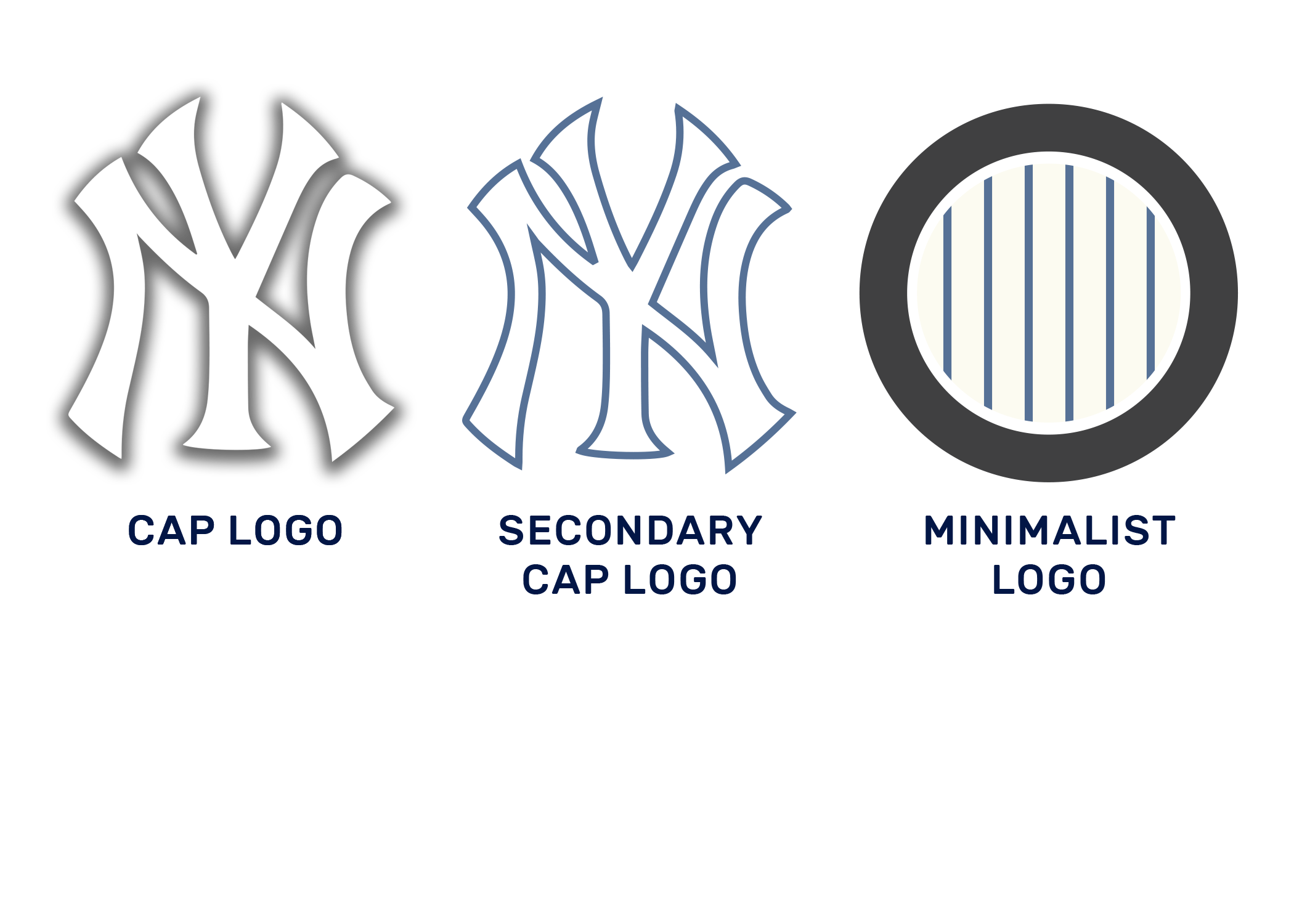
I kept the primary cap log pretty close to the classic, and decided to make a minimal adjustment to the secondary cap by outlining it with a slim navy. As a minimalist version of the Yankees logo, I figured a circle of pinstripes says it all.

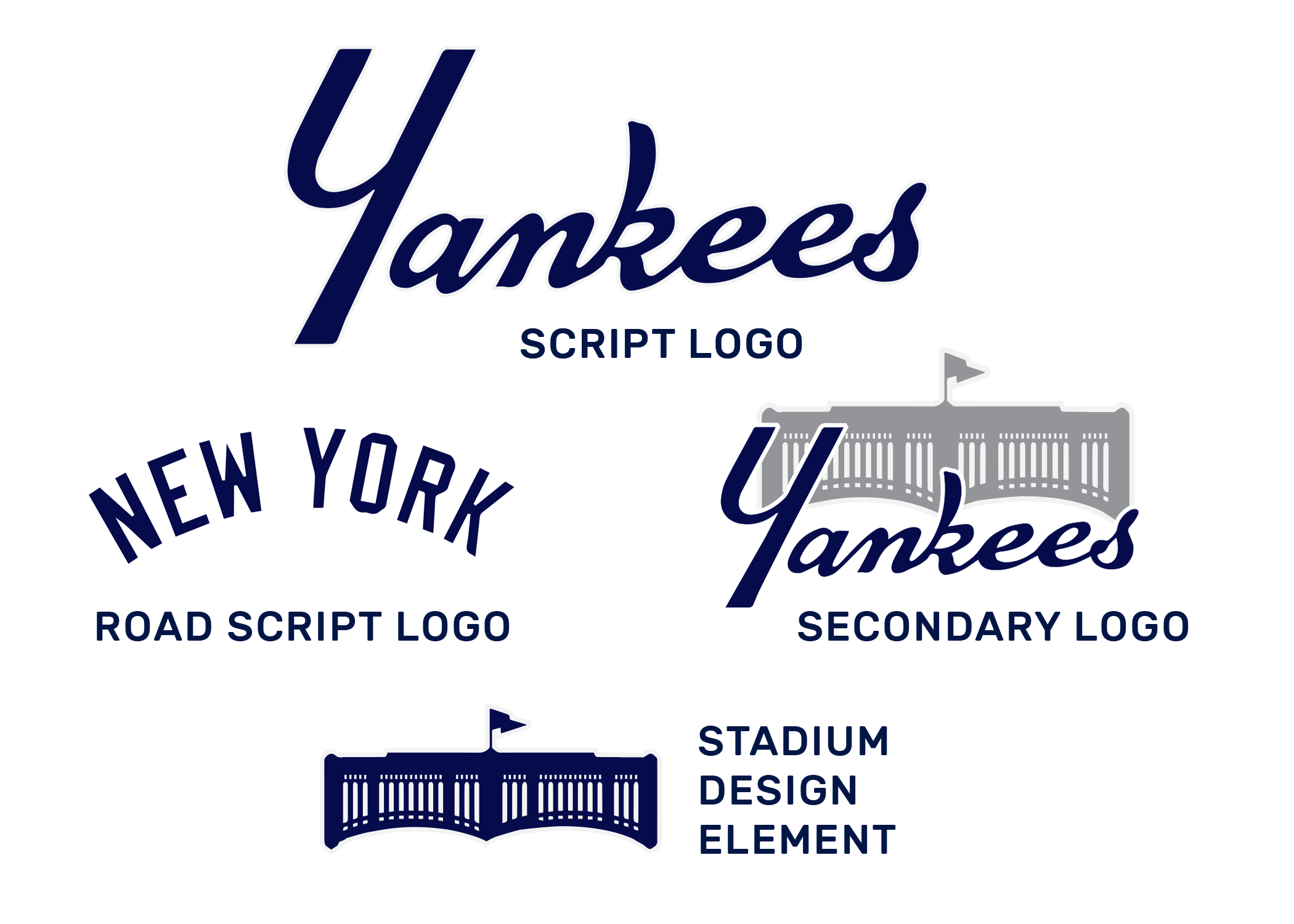
Yankees - Script.png

For script logos, I continued on the process of carrying over the YANKEES script based on their primary logo. Their jerseys will increase the prominence of this script. I kept the classic NEW YORK road script and created alternates by including a silhouette design of Yankee Stadium’s fence.

Yankees - Jerseys 1.png

For jerseys, I kept the look pretty classic for home and road jerseys. Pinstripes, which have been gently lightened, and the classic road greys.

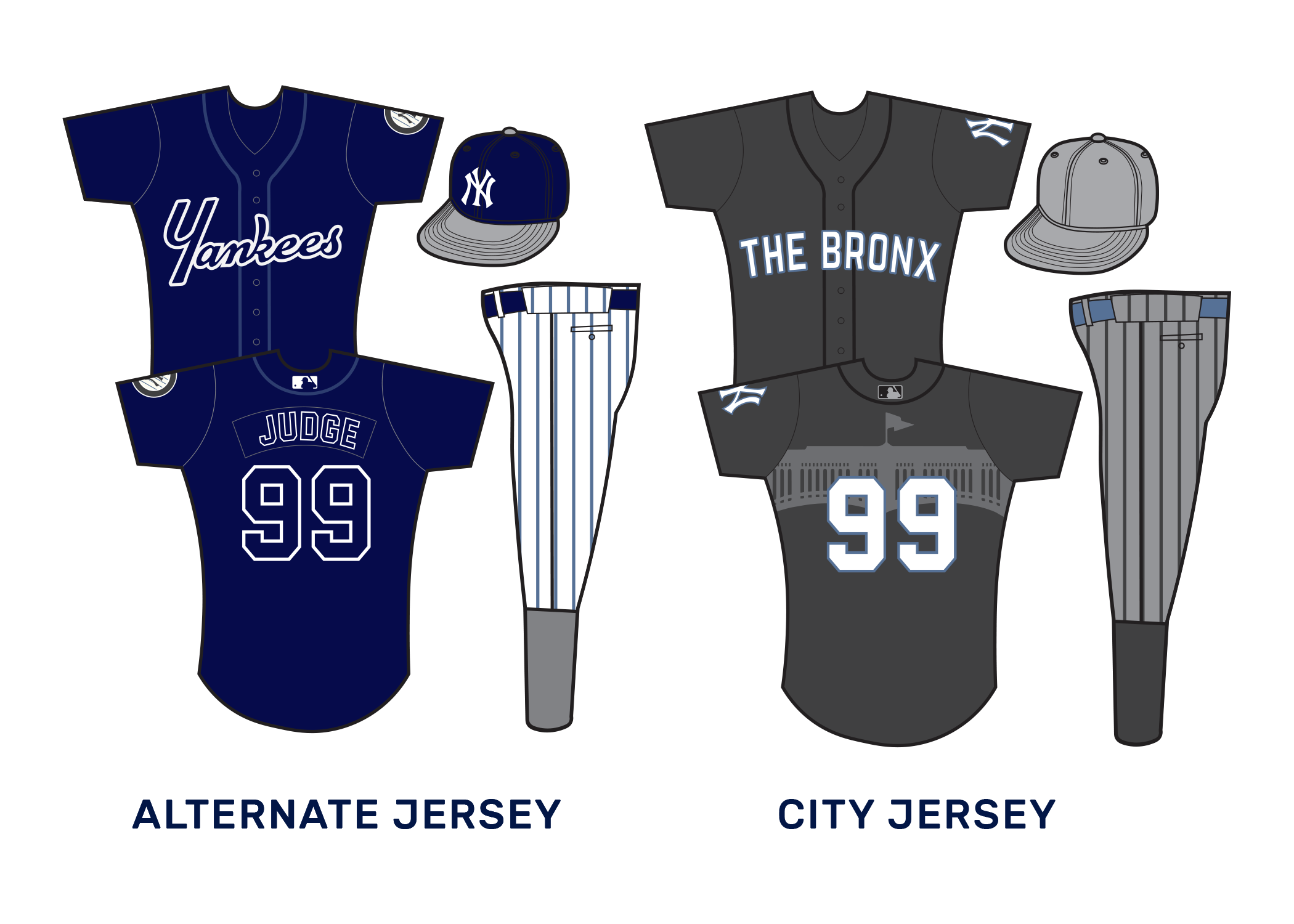
Yankees - Jerseys 2.png

As an alternate jersey, I decided to hammer down on the Navy and to give the YANKEES script a chance to be more shown off. It’ll also introduce the first time players’ names appear on the back.

The City jersey, meant for special occasions, goes bold with grey and black pinstriped pants, a logoless grey cap, the Yankee Stadium fence printed on the jersey back. THE BRONX is spelled out on the front, to represent the home burrough.

BOSTON RED SOX

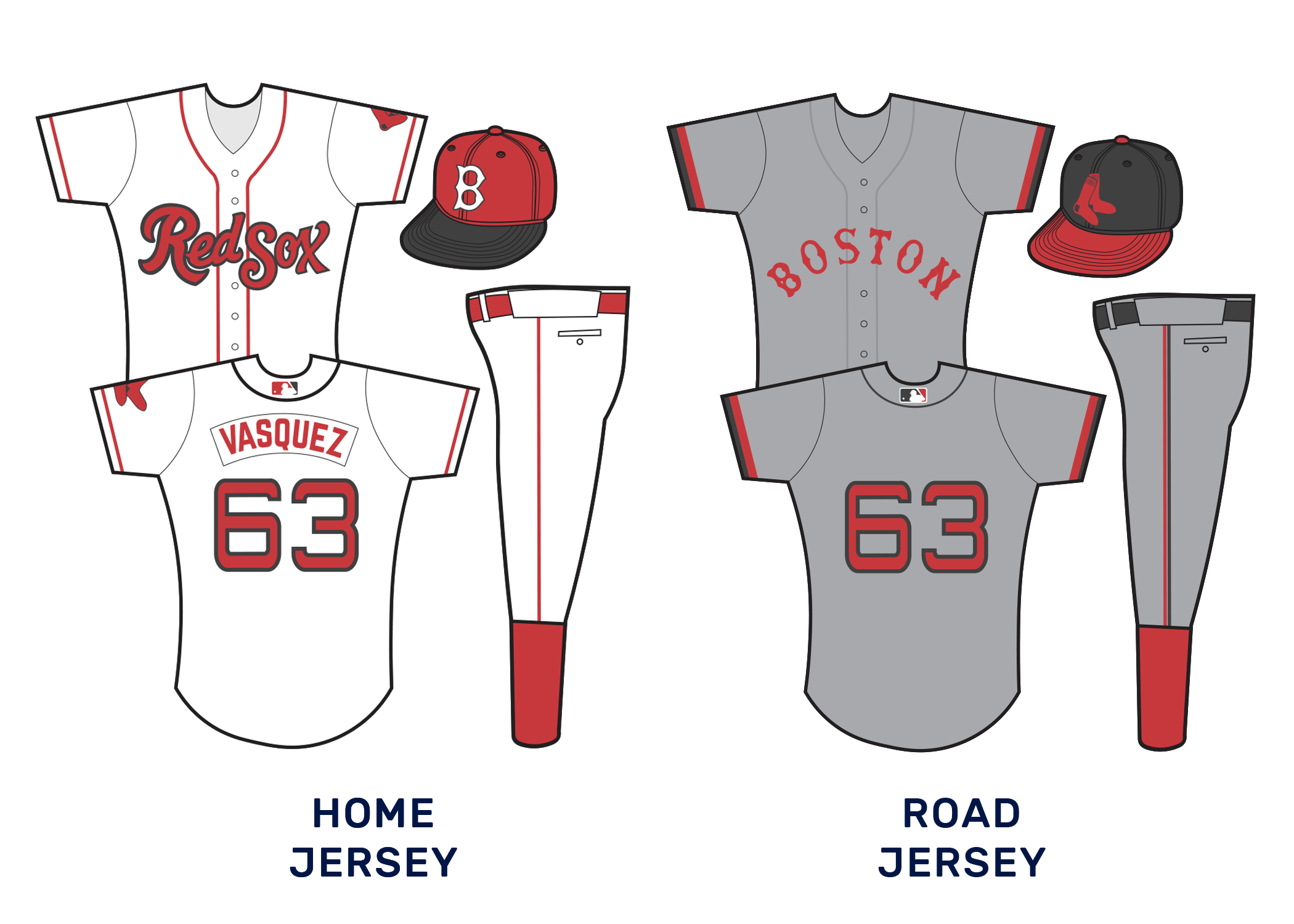
The Red Sox are an interesting case. The brand is no doubt iconic. But unlike the Yankees, they have had much more openness to evolving their brand over the years, while still sticking mostly to a few classic elements. I tried to push the envelope just a bit further.

Red Sox - Primary.png

The two overlapping socks are a classic design. And if your team is named after red socks, then they’ve got to feature in somewhere. The team has been married to the circular logo as a primary design for so long, but what if the socks were more interlinked with cursive text? For those still attached to circles, I kept a looser circle version of the logo around as a secondary, and crafted an alternate based on past logos, but more simplified and on a dark background.

Speaking of, I decided to up the prominence of black (actually, a deep charcoal grey) in the Red Sox logo. This, in lieu of navy, to help further differentiate them from the excess of red-and-blue teams.

Red Sox - Script.png

The script of the RED SOX logo is bold, while still meant to carry the feeling of a classic Boston cursive. As a secondary script and design elements, I brought back the bold white text on the extended stocking design, and re-incorporated it on jerseys and otherwise. The old style script still lives on in the form of the road logo, since the minimal road jerseys have always looked sleek.

Red Sox - Cap.png

As far as caps go, a more 60's version of the classic B was incorporated. The pair of socks always looks classic on a hat though, so both a black outlined version and a pure red version are used.

Red Sox - Jerseys 1.png

The home and road jerseys don’t exactly re-invent the wheel. The home jerseys eliminate the navy piping from before and introduce the new script logo. It also adds a black bill to the cap. Cap colors are inverted for the road jersey, which is simply a refresh of the current road jersey. BOSTON is switched to red, and sleeve bands are introduced. The numbers on both remain extended.

Red Sox - Jerseys 2.png

A proper Red Sox alternate should emphasize red, and this one does that through its deep color and by using the pair of socks patch. The black and red cap is reused here. For a CITY jersey, we used a bit of a throwback- using just the script-on-sock on the jersey. We also eliminated every color but red and white for this one, doubling down on the Beantown’s red-associated identity.

PUERTO RICO GARGOLAS

Puerto Rico? Yes! But Gargolas? What’s the Spanish translation for Gargoyle got to do with much?

As it turns out, Gargoyles feature pretty prominently in Puerto Rican folklore, and reported flying Gargoyle sightings aren’t uncommon in parts of the island. Plus, it introduces a team nickname that hasn’t been overdone, and a chance for some cool nocturnally inspired logo and uniform options.

Gargolas - Primary.png

Illustrating a Gargoyle for a sports logo was harder than I anticipated. It seemed like there were some easy illustrations that could’ve been done, but it was hard to do it justice. Then I came upon the more minimalist shape based design and it stuck. The more detailed gargolye could work as an alternate, and a logo with a more 90s and early 2000s look, and the rectangular shape of the island worked well as an alternate. For the primary logo, though, the minimalist gargoyle worked well on top of a blue triangle. The color both contained hints at the nocturnal feel of the team, and the blue triangle featured on Puerto Rico’s flag.

Gargolas - Script.png

Script logos were a bit of a challenge. I wanted to accomplish a more jagged look, to try and capture both the spooky feeling attached to gargoyles, and the stone carving. The text also needed to reflect a bit of gothic style that still worked for the island. I think this worked.

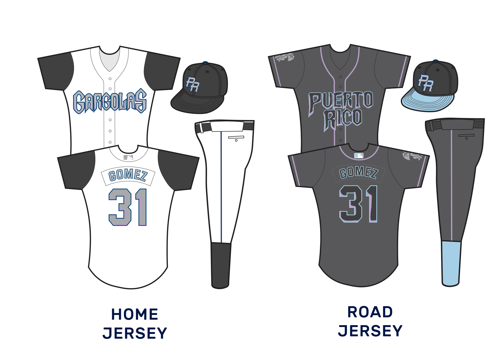
The colors were chosen intentionally to try and use black as much as possible. This called for the scripts to be a lighter grey to be more legible. Light purple and blue tones were used as highlights, but in an underscored way to keep the focus on black and darker colors. The color palate was inspired by a haunting evening, when gargoyle sightings usually take place.

Gargolas - Cap Logos.png

For the cap logo, I went with something familiar: The PR used on the World Baseball Classic uniforms. I simply switched the colors to Gargoyle colors. As a secondary option, I planted the logo over the shape of Puerto Rico. As the team continues, the hope is to get the Gargoyle shape further associated with pride in the island.

Gargolas - Jerseys 1.png

I wanted all jerseys to reflect the team’s darkness. For home whites, that was accomplished by making the sleeves black and going with a simple black cap. The text is a lighter grey with navy outlines and purple textures. For the road jersey, a darker-than-usual grey will be used, similar to recent Diamondbacks uniforms. The highlights of blue and purple stand out even more on this background, especially with embroidery appearing darker.

Gargolas - Jerseys 2.png

For an alternate, we tried to emphasize the black as much as possible, going with an all black jersey with mostly grey patchwork. We simply added a little bit of blue and purple trim. The simplified gargoyle features strongly on an all black cap.

The city jersey was a bit of a bolder choice. We drifted the team further from the nocturnes and towards Puerto Rican flag colors. Red and White striped bands on the arms and the socks were meant to invoke the flag’s stripes. The shape of Puerto Rico was also used mostly in lieu of a team name, although the primary cap logo features on the left side of the chest.

HOLY CITY DEACONS

Next up, we brought baseball to the Carolinas. Let’s start with the team further south- the Holy City Deacons.

Charleston is a fun city. For this team, I decided to focus on its identity as a hub for historical churches and its nickname as the Holy City. I decided to even double down on that name, using the city’s nickname, rather than Charleston, as its primary brand name.

Religious sports mascots are always fascinating, though also challenging to work with. How do you make a priest intimidating but not creepy? Priests look different based on denomination, etc. How do you pick one look?

I went with a deacon, as an easier clergyperson to work with. The only team I know of to have gone that route was Wake Forest- and they’re the Demon Deacons. That’s an even harder concept.

Deacons - Primary.png

For team colors, we went with black, dark brown, light brown, and gold. This was meant to evoke images of priests’ robes, golden relics, leather bibles, church pews, etc. The primary logo contains rays that could evoke a Jesuit sun, as the deacon moves forward with a generic robe. The alternate logo also carries a feel of a religious icon.

Deacons - Script.png

The script for the team is very boxy and angular. This conjures up images of Biblical printing.

Deacons - Caps.png

Something makes me think that a HOLY CITY cap would be pretty attractive to those with local pride. A more cartoonish version of the deacon from the main logo can be used alternatively.

Deacons - Jerseys 1.png

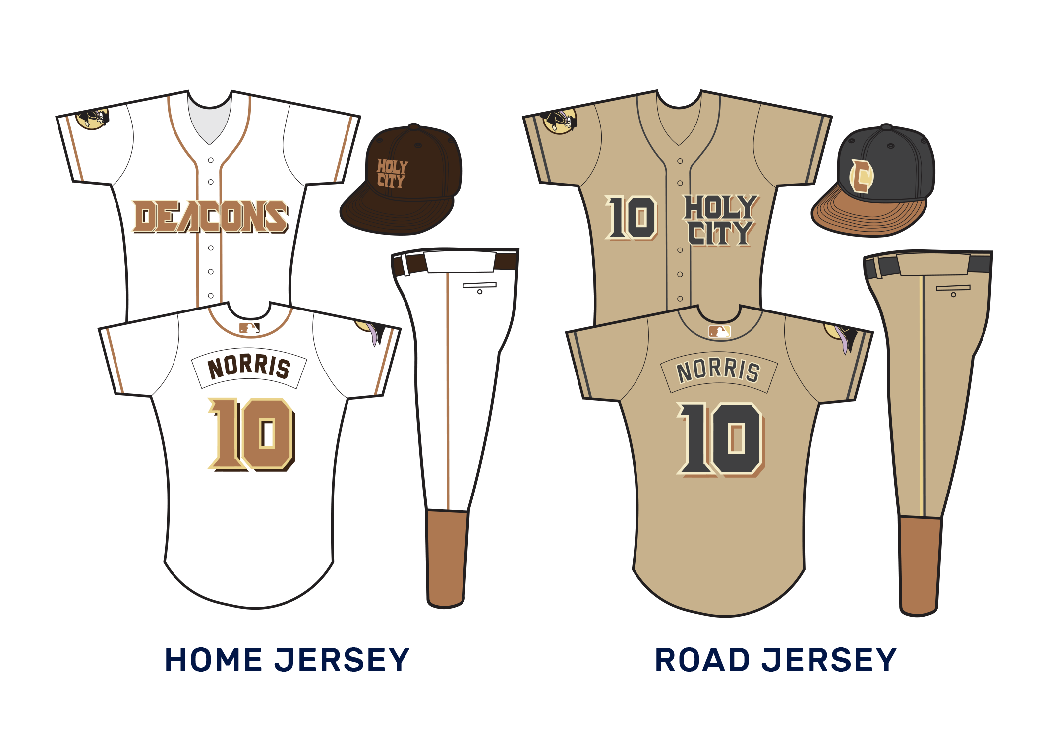
Brown lends itself to interesting jersey choices. One challenge is maintaining an identity separate enough from the Padres’ return to brown and yellow. I aimed to do this by emphasizing black when possible, while using a much lighter shade of brown.

For the road jersey, I did something bold and went with all khaki jerseys. The Padres in the mid-2000’s attempted a sand colored scheme to mixed results. But with the expanded league, this opens up the possibility for bolder combinations.

Deacons - Jerseys 2.png

On the alternate jersey, purple piping was meant to emphasize priests’ robes. The black and gold of the cap also stood out as attractive.

I thought the team branding was incomplete without a darker brown jersey, so I decided to use the city jersey to add that. In lieu of a team name, I decided to go with the palmyra tree featured on the state flag blown up as a larger design on the jersey.

CHARLOTTE, NEW ENGLAND, AND BALTIMORE DESIGNS COMING SOON!

Blowin' Up Baseball: The Ultimate MLB Expansion

5dd35dbf4d5b6.image.jpg

THE FICTIONAL SCENARIO WHERE I NEARLY DOUBLED THE SIZE OF MAJOR LEAGUE BASEBALL AND REBRANDED EVERY TEAM

I love baseball. I love branding. I love the combination of these two things.

Sports logos, jerseys, team uniforms, nicknames, all that. I get thrilled by announcements like the San Diego Padres going back to their brown color scheme. Or by the Phillies rocking their powder-blue throwback jerseys on certain nights. I even love the downright weird branding that goes on in Minor League Baseball. Where else will you see teams take risks with names like the Chihuahuas, the Trash Pandas, or the Booyah!?

Chihuhuahuas.jpg
trash pandas.jpg
Booyah.png

It goes without saying, then, that I tend to have pretty strong opinions when it comes to logos, uniforms, and branding across baseball. Opinions like:

  • Way too many teams use the primary red and blue color scheme.

  • The MLB would benefit from the trend towards sleek minimalism in logos going on in the NBA right now.

  • Unique team names relevant to the location are always more interesting.

  • The Diamondbacks should get over their identity crisis and go back to the teal-and-purple look they started with.

  • High socks are a classic look that should be mandated.

The idea of Major League Baseball expanding also intrigues me. I see articles all the time about how baseball expansion is inevitable. I hear about strong movements in places like Portland and Montreal to try and get teams up and running over there. I would love to #BringBacktheExpos. Then there are a bunch of cities that aren’t realistic baseball towns at all that I still love enough to fantasize about being added to the league. New Orleans. Vancouver. OKC.

image.jpg

So I decided to let my imagination run wild and dream of a scenario where Major League Baseball expanded to 56 teams. Yes, almost doubling in size. I also humored my designer side and began a project to create uniforms and logos for each of them- even the teams that already exist.

I present to you, my dream team of teams.

So… a 56-team league? How would this far-fetched idea even work?

Well, this is totally fictional, so pretty much anything is possible. I could create six teams in Martha’s Vineyard if I so chose. But actually, I loosely based the idea on English Football, where the connections between almost 150 different leagues creates the possibility of 7,000 teams participating. Promotion and relegation allows a team’s performance to advance them upwards or downwards in different divisions, so that some teams frequently move between levels 1 & 2, 2 & 3, and so on. At least in theory, the smallest most obscure team has a shot of being a true underdog.

So in this scenario, 28 teams actively play at the top level each season– two leagues, eight divisions, four teams per division. However, each division permanently consists of seven teams, three of which are do not play in the top level each season. After each season, the 5th & 6th ranked teams have a chance to earn their way into the top level through their record against each other, and by challenging the 3rd and 4th ranked teams in play-in series.

It’s complicated, I know, but it allowed me to dream up more teams.

GettyImages-1161847425-e1565937082951-1024x683.jpg

So how does the league look like under this arrangement?

That’s the fun part.

THE AMERICAN LEAGUE

AL WEST

California Angels
Oakland Athletics
Seattle Mariners
Salt Lake City Bees
Sacramento Solons
Vancouver Ospreys
Mexico City Ozomatli

AL south

Texas Rangers
Houston Astros
Kansas City Royals
San Antonio Scorpios
OKC Monarchs
Louisville Bats
Austin Armadillos

AL NORTH

Cleveland Spiders
Chicago White Sox
Detroit Tigers
Toronto Blue Jays
Minnesota Twins
Calgary Snowdogs
Buffalo Bisons

AL EAST

New York Yankees
Boston Red Sox
Baltimore Orioles
Carolina Pilots
Holy City Deacons
New England Claws
Puerto Rico Gargolas

THE NATIONAL LEAGUE

nl WEST

Los Angeles Dodgers
San Francisco Giants
Colorado Rockies
San Diego Padres
Phoenix Rattlers
Portland Pines
Las Vegas Aces

NL south

Miami Marlins
Atlanta Braves
Tampa Bay Stingrays
New Orleans Krewe
Orlando Orcas
Jacksonville Torpedoes
Memphis Pharoahs

NL NORTH

Chicago Cubs
St. Louis Cardinals
Cincinnati Reds
Milwaukee Brewers
Columbus Agents
Indiana Flayers
Omaha Knights

NL EAST

Philadelphia Phillies
Pittsburgh Pirates
New York Mets
Montreal Expos
Washington Nationals
Ottawa Owls
Nashville Outlaws

And now for the even more fun part… the full on branding. I’m going one division at a time, so stay tuned for the ones that have yet to be posted.

padres-new-uniforms.png

THE REBRAND

I decided to impose a few rules on myself for this rebrand project.

  • For each team I designed the following: A primary logo, two secondary logos, three script logos, a minimalist logo, and two cap logos.

  • I also designed four jerseys per team: a white home jersey, road greys, an alternate in some form of team colors, and a “city jersey” inspired by the locale-based NBA jerseys.

  • One of my enforced rules was that no more than two teams could share the exact same color scheme- I wanted to force bolder color palette choices.

  • I forced myself to redesign every team, no matter how “classic” their current look is. For some, it meant more minor tweaks, or only modifying some logos. But I didn’t want to get away with just hitting copy and paste for the Yankees, Tigers, or Dodgers.

Anyways, here’s what I came up with:

The American League East

Alex Wood.jpg

The Yankees and Red Sox rivalry continues, and the Orioles maintain their legacy in the mix. Speaking of rivals, a Carolina rivalry is born as an old team is resurrected in Charlotte and a new one rises in Charleston. New England also gets a second team, while expansion also spreads us into baseball lovin’ Puerto Rico.

THE AMERICAN LEAGUE SOUTH

(Coming Soon)

THE AMERICAN LEAGUE NORTH

(Coming Soon)

THE AMERICAN LEAGUE WEST

(Coming Soon)

THE NATIONAL LEAGUE EAST

(Coming Soon)

THE NATIONAL LEAGUE NORTH

(Coming Soon)

THE NATIONAL LEAGUE CENTRAL

(Coming Soon)

THE NATIONAL LEAGUE WEST

(Coming Soon)

Oracle Peak State Park

Oracle Peak State Park in Arizona is known for an interesting rock formation. The side of the mountain seems to resemble a giant watching eyeball, which lends the mountain its name.

As if that weren’t enough to tickle the fancy of mystery lovers, the park is also home to some bigfoot sightings!

An enthusiast for the park recently reached out to me to design a concept for an embroidered patch celebrating the park.

Oracle Peak.png