Time to start in what has been baseball’s most high profile division, historically. The American League East.
Running four divisions per league allows for more geographic consideration for which locations are considered. My version of the AL East is mostly built off the Eastern Seaboard, but with a pretty wide vertical span from north to south.
First of all, there was no way I was breaking up the most historical rivalry. The Boston Red Sox and New York Yankees stayed in the East. And I kept the Baltimore Orioles around as the other legacy team in the division. I decided to create a rivalry in the Carolinas, by introducing the Holy City Deacons in Charleston and reviving the Seattle Pilots but sending them to North Carolina to be the Charlotte Pilots. I decided to add another team in New England- the New England Claws. They, don’t play in Boston, exactly, but everywhere else. Also, I always thought that expansion would be most fun if it weren’t limited to the continental U.S., so I decided to loop in the Puerto Rico Gargolas.
Without any further wait, here are the teams and their designs.
NEW YORK YANKEES
How do you take on such a classic, tradition-based team?
The current Yankees primary logo has been in use since the 40’s, cementing it as iconic and making it practically unthinkable for anybody to reimagine a new primary logo. But it’s a mostly red design that uses a YANKEES text that isn’t used much elsewhere. It also incorporates an Uncle Sam hat that the team seems uninterested in using anywhere else. I wondered if we could instead use a design element much more strongly associated with the Yankees– pinstripes. And maybe we could use this to once and for all eliminate the red.
The primary logo is a simple circle enclosing the pinstripes, with a reimagined text, loosely based on their real primary logo. I trimmed the Uncle Sam Hat and used two different shades of navy to add some depth to the logo. As a secondary logo, I replaces the pinstripe fill in the circle with an outline of the Yankee Stadium fence- another of their iconic patterns. As an alternate, I imagined a simple circle enclosing the pinstripe pattern, superimposed with the classic NY cap logo. This one pushes for more black, in addition to the Navy.
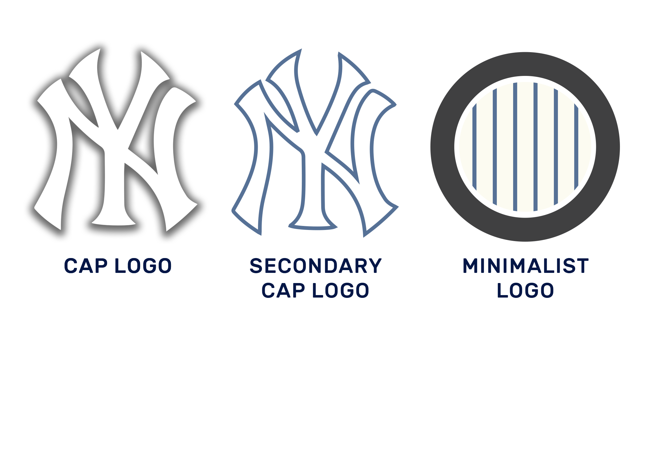
I kept the primary cap log pretty close to the classic, and decided to make a minimal adjustment to the secondary cap by outlining it with a slim navy. As a minimalist version of the Yankees logo, I figured a circle of pinstripes says it all.
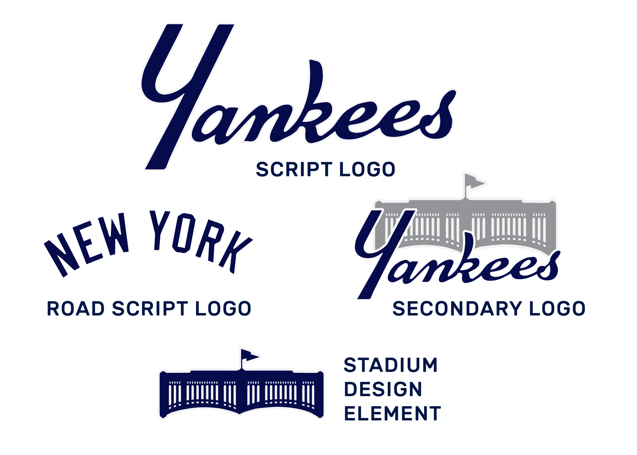
For script logos, I continued on the process of carrying over the YANKEES script based on their primary logo. Their jerseys will increase the prominence of this script. I kept the classic NEW YORK road script and created alternates by including a silhouette design of Yankee Stadium’s fence.
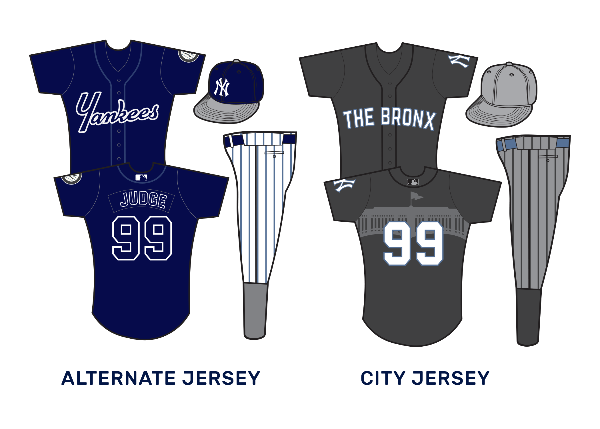
For jerseys, I kept the look pretty classic for home and road jerseys. Pinstripes, which have been gently lightened, and the classic road greys.
As an alternate jersey, I decided to hammer down on the Navy and to give the YANKEES script a chance to be more shown off. It’ll also introduce the first time players’ names appear on the back.
The City jersey, meant for special occasions, goes bold with grey and black pinstriped pants, a logoless grey cap, the Yankee Stadium fence printed on the jersey back. THE BRONX is spelled out on the front, to represent the home burrough.
BOSTON RED SOX
The Red Sox are an interesting case. The brand is no doubt iconic. But unlike the Yankees, they have had much more openness to evolving their brand over the years, while still sticking mostly to a few classic elements. I tried to push the envelope just a bit further.
The two overlapping socks are a classic design. And if your team is named after red socks, then they’ve got to feature in somewhere. The team has been married to the circular logo as a primary design for so long, but what if the socks were more interlinked with cursive text? For those still attached to circles, I kept a looser circle version of the logo around as a secondary, and crafted an alternate based on past logos, but more simplified and on a dark background.
Speaking of, I decided to up the prominence of black (actually, a deep charcoal grey) in the Red Sox logo. This, in lieu of navy, to help further differentiate them from the excess of red-and-blue teams.
The script of the RED SOX logo is bold, while still meant to carry the feeling of a classic Boston cursive. As a secondary script and design elements, I brought back the bold white text on the extended stocking design, and re-incorporated it on jerseys and otherwise. The old style script still lives on in the form of the road logo, since the minimal road jerseys have always looked sleek.
As far as caps go, a more 60's version of the classic B was incorporated. The pair of socks always looks classic on a hat though, so both a black outlined version and a pure red version are used.
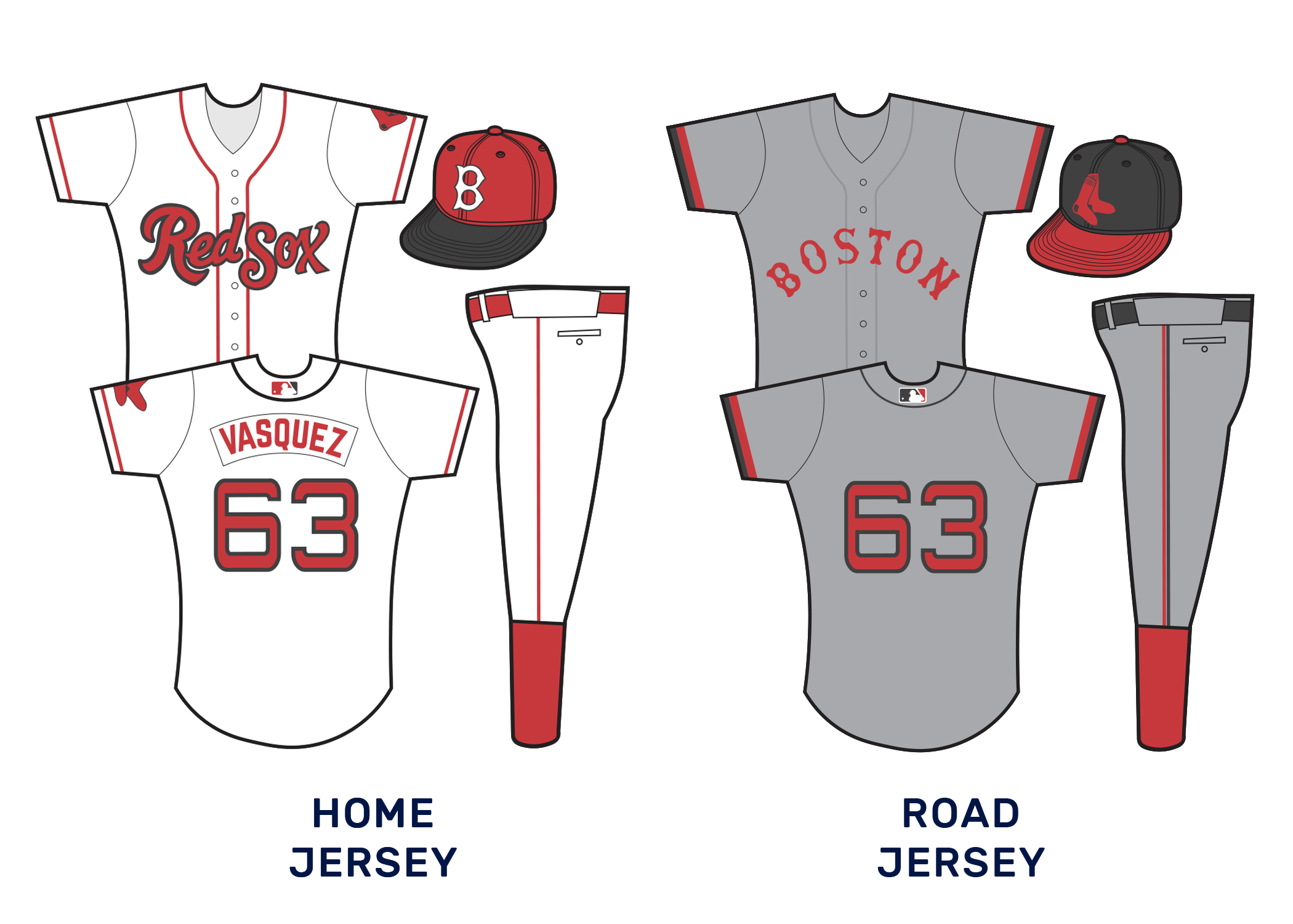
The home and road jerseys don’t exactly re-invent the wheel. The home jerseys eliminate the navy piping from before and introduce the new script logo. It also adds a black bill to the cap. Cap colors are inverted for the road jersey, which is simply a refresh of the current road jersey. BOSTON is switched to red, and sleeve bands are introduced. The numbers on both remain extended.
A proper Red Sox alternate should emphasize red, and this one does that through its deep color and by using the pair of socks patch. The black and red cap is reused here. For a CITY jersey, we used a bit of a throwback- using just the script-on-sock on the jersey. We also eliminated every color but red and white for this one, doubling down on the Beantown’s red-associated identity.
PUERTO RICO GARGOLAS
Puerto Rico? Yes! But Gargolas? What’s the Spanish translation for Gargoyle got to do with much?
As it turns out, Gargoyles feature pretty prominently in Puerto Rican folklore, and reported flying Gargoyle sightings aren’t uncommon in parts of the island. Plus, it introduces a team nickname that hasn’t been overdone, and a chance for some cool nocturnally inspired logo and uniform options.
Illustrating a Gargoyle for a sports logo was harder than I anticipated. It seemed like there were some easy illustrations that could’ve been done, but it was hard to do it justice. Then I came upon the more minimalist shape based design and it stuck. The more detailed gargolye could work as an alternate, and a logo with a more 90s and early 2000s look, and the rectangular shape of the island worked well as an alternate. For the primary logo, though, the minimalist gargoyle worked well on top of a blue triangle. The color both contained hints at the nocturnal feel of the team, and the blue triangle featured on Puerto Rico’s flag.
Script logos were a bit of a challenge. I wanted to accomplish a more jagged look, to try and capture both the spooky feeling attached to gargoyles, and the stone carving. The text also needed to reflect a bit of gothic style that still worked for the island. I think this worked.
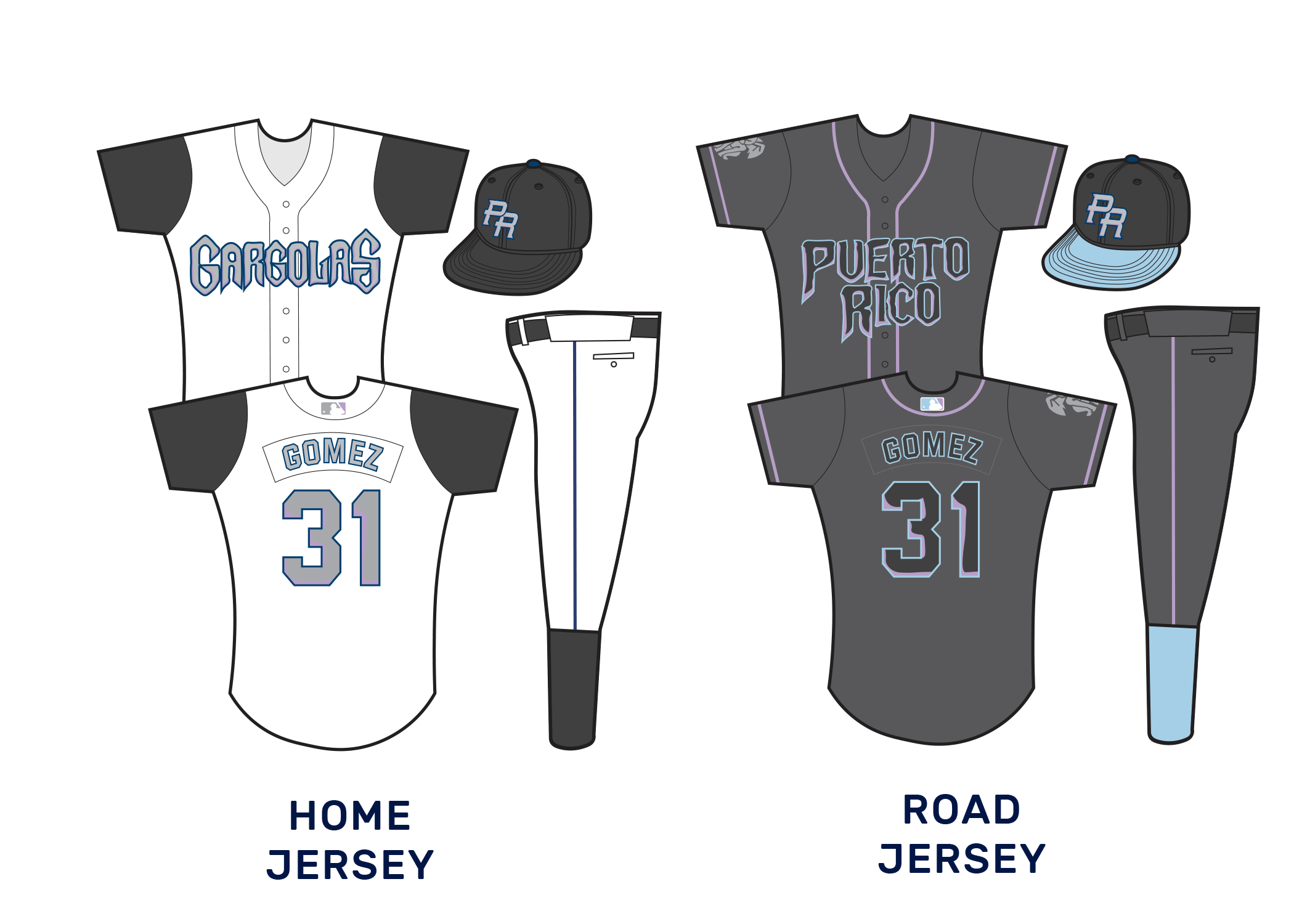
The colors were chosen intentionally to try and use black as much as possible. This called for the scripts to be a lighter grey to be more legible. Light purple and blue tones were used as highlights, but in an underscored way to keep the focus on black and darker colors. The color palate was inspired by a haunting evening, when gargoyle sightings usually take place.
For the cap logo, I went with something familiar: The PR used on the World Baseball Classic uniforms. I simply switched the colors to Gargoyle colors. As a secondary option, I planted the logo over the shape of Puerto Rico. As the team continues, the hope is to get the Gargoyle shape further associated with pride in the island.
I wanted all jerseys to reflect the team’s darkness. For home whites, that was accomplished by making the sleeves black and going with a simple black cap. The text is a lighter grey with navy outlines and purple textures. For the road jersey, a darker-than-usual grey will be used, similar to recent Diamondbacks uniforms. The highlights of blue and purple stand out even more on this background, especially with embroidery appearing darker.
For an alternate, we tried to emphasize the black as much as possible, going with an all black jersey with mostly grey patchwork. We simply added a little bit of blue and purple trim. The simplified gargoyle features strongly on an all black cap.
The city jersey was a bit of a bolder choice. We drifted the team further from the nocturnes and towards Puerto Rican flag colors. Red and White striped bands on the arms and the socks were meant to invoke the flag’s stripes. The shape of Puerto Rico was also used mostly in lieu of a team name, although the primary cap logo features on the left side of the chest.
HOLY CITY DEACONS
Next up, we brought baseball to the Carolinas. Let’s start with the team further south- the Holy City Deacons.
Charleston is a fun city. For this team, I decided to focus on its identity as a hub for historical churches and its nickname as the Holy City. I decided to even double down on that name, using the city’s nickname, rather than Charleston, as its primary brand name.
Religious sports mascots are always fascinating, though also challenging to work with. How do you make a priest intimidating but not creepy? Priests look different based on denomination, etc. How do you pick one look?
I went with a deacon, as an easier clergyperson to work with. The only team I know of to have gone that route was Wake Forest- and they’re the Demon Deacons. That’s an even harder concept.
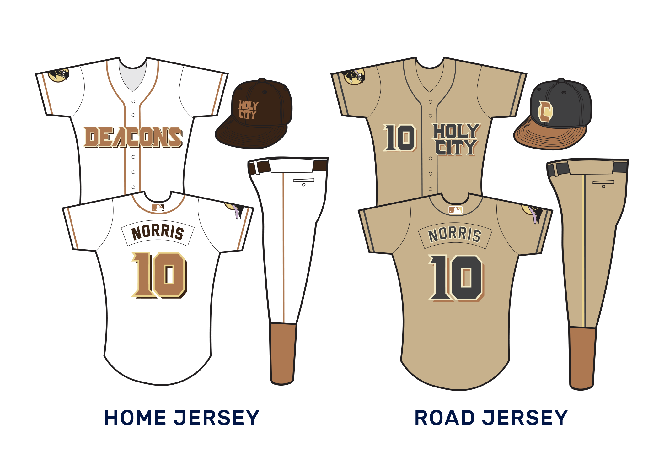
For team colors, we went with black, dark brown, light brown, and gold. This was meant to evoke images of priests’ robes, golden relics, leather bibles, church pews, etc. The primary logo contains rays that could evoke a Jesuit sun, as the deacon moves forward with a generic robe. The alternate logo also carries a feel of a religious icon.
The script for the team is very boxy and angular. This conjures up images of Biblical printing.
Something makes me think that a HOLY CITY cap would be pretty attractive to those with local pride. A more cartoonish version of the deacon from the main logo can be used alternatively.
Brown lends itself to interesting jersey choices. One challenge is maintaining an identity separate enough from the Padres’ return to brown and yellow. I aimed to do this by emphasizing black when possible, while using a much lighter shade of brown.
For the road jersey, I did something bold and went with all khaki jerseys. The Padres in the mid-2000’s attempted a sand colored scheme to mixed results. But with the expanded league, this opens up the possibility for bolder combinations.
On the alternate jersey, purple piping was meant to emphasize priests’ robes. The black and gold of the cap also stood out as attractive.
I thought the team branding was incomplete without a darker brown jersey, so I decided to use the city jersey to add that. In lieu of a team name, I decided to go with the palmyra tree featured on the state flag blown up as a larger design on the jersey.


